The Order Book is tabular and fluid so can be difficult to read, though as we’;ll see serious traders don’t do things simply by eye.
To help provide an easy way to interpret what the Order Book is saying, Bids and Asks and their relative amounts are visually represented in a Depth Chart.
The Depth Chart is roughly V shaped, made up of two sloping right angled triangles with prospective buyers on one side (from the Order Book) with the highest Bid meeting lowest Ask of all the prospective Sellers on the other side.
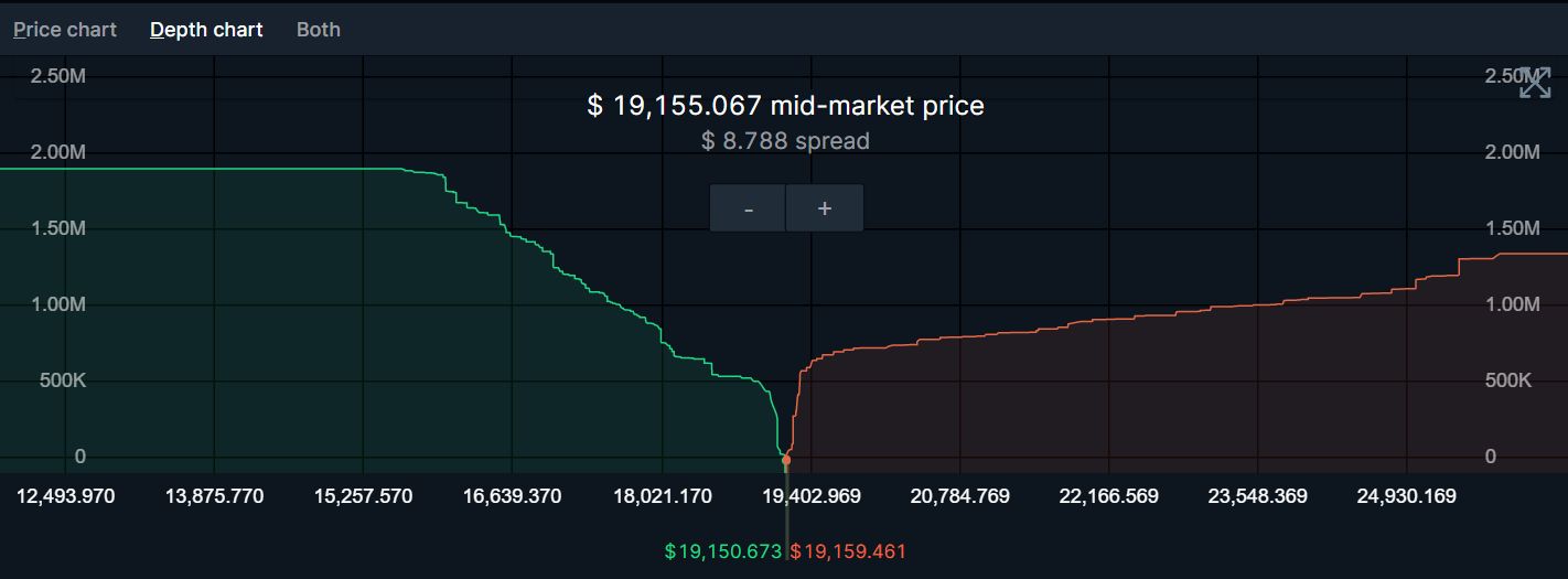
The Depth Chart can make it easier to find resistance levels – where declining a price is likely to stabilise – or sell walls where an increasing price may struggle to overcome a large number of Asks at a given price..
Of course the Order Book and Depth Chart are dynamic. The sentiment of all participants is constantly changing so what you discern from the data is only as valuable as the stability of that sentiment.
So while analysing and digesting charts, you’ll need to also keep an eye of the information that the charts are reacting to. We’ll discuss this later on.
Leave a Reply